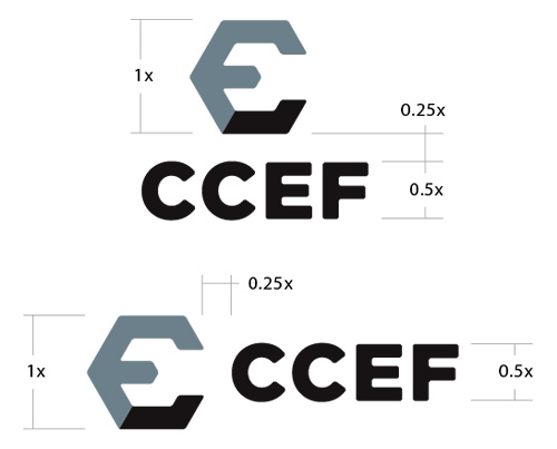
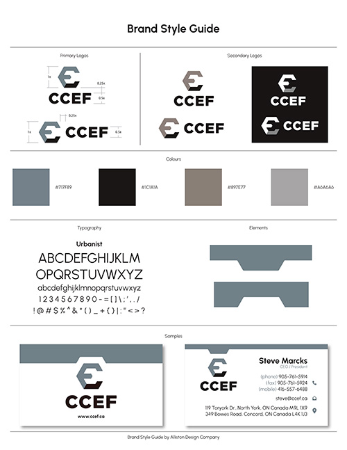
Canadian Commercial Equipment Fabricators was looking to create new visual branding for their expanding business. We were tasked with developing a new visual brand standard for them that was more modern and reflected the manufacturing and fabrication aspects of their business. The new CCEF logo mark is a combination of the Letters within their name and work together to form the shape of a wrench. The colours were selected to emulate the metals and other materials the company works with but can be easily adjusted when required. An example of this is the red used to make the service sticker stand out on equipment.


